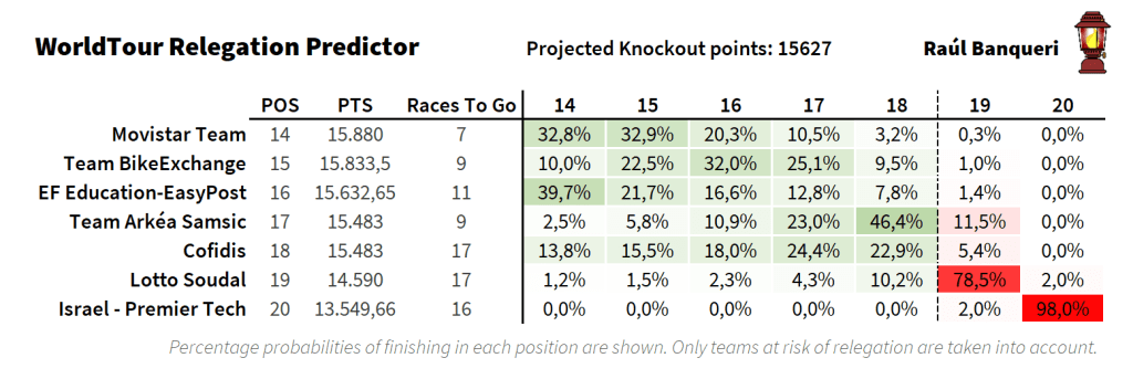
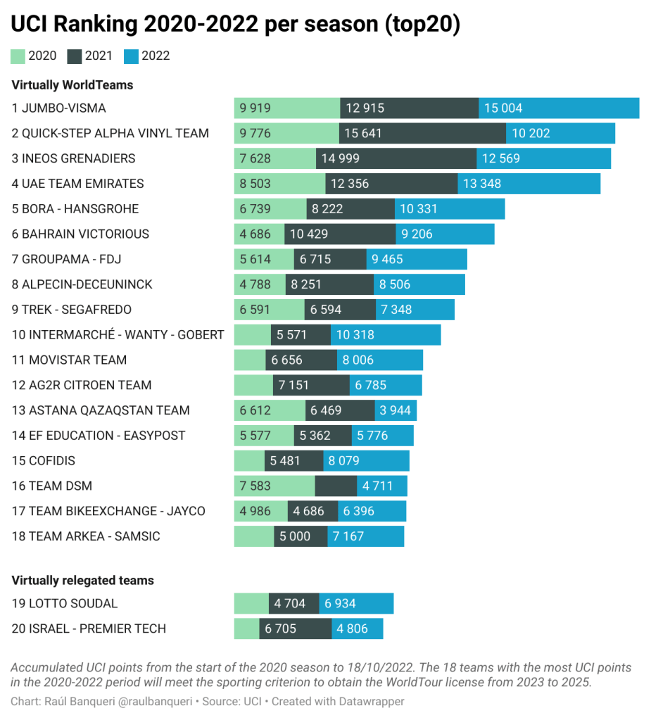
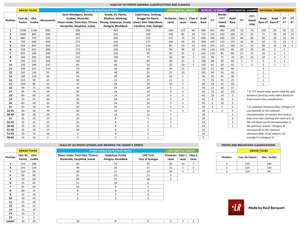
In 2022, I started working with the international media Lanterne Rouge as a data journalist. You can read my latest articles. My main job was to update and analyse a secret ranking that was used to decide the promotions and relegations in men’s road cycling. After months of work, I became one of the world’s references for following the relegation battle. The page where I updated the ranking daily exceeded half a million visits.
In addition to focusing on a topic where there was an information gap, I think the key has been to explain a complex issue with clear and understandable graphics. Of course, accuracy is also a pillar of data visualisation and has cemented the public’s trust and credibility in my analysis. All journalists should thoroughly proofread their publications, but in the case of a data journalist it is even more essential.
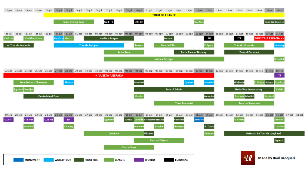
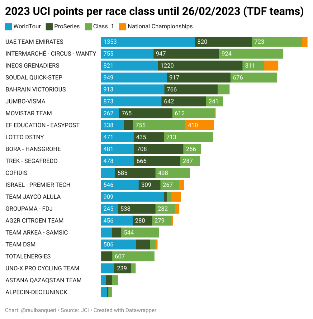
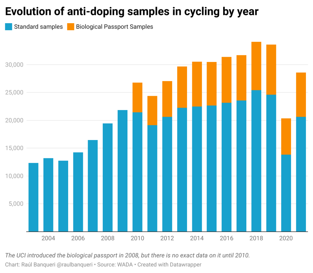
Below are examples of data visualisations I have published in Lanterne Rouge: